How We Rebranded a Local Cafe
CLIENT : CHINOS
Services Provided : Logo Design | Branding | Signage Design
When the new owner approached us, it felt like fate whispering in our ears. This was because it was Jess's mother who co-founded the cafe all those years ago! Can you believe it? It was an emotional reunion and a nostalgic project for both of us!
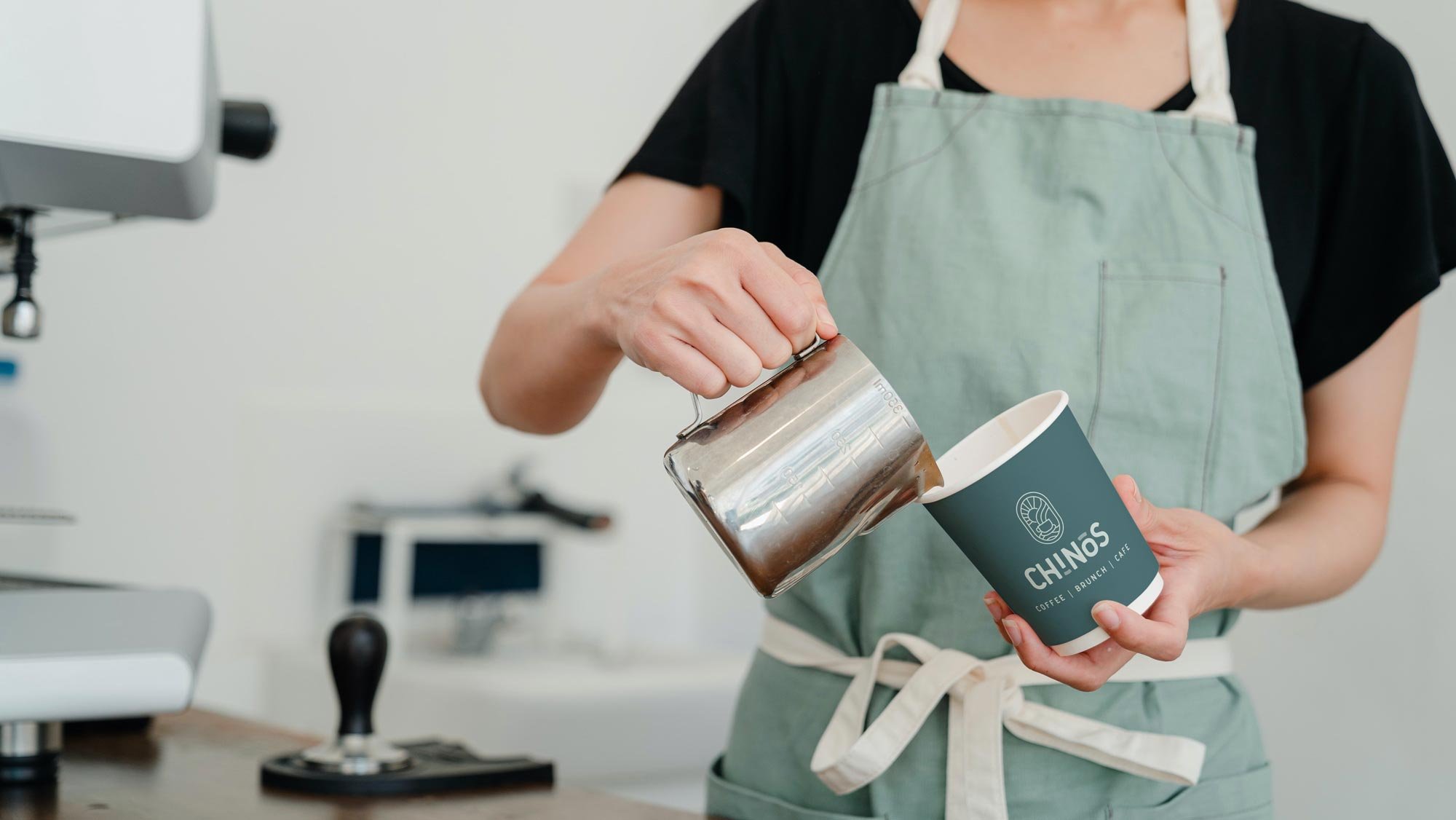
The logo flaunts a chic deco-style icon paired with a custom font, boosting its impact and readability. Sneaky little accent lines beneath the 'i' and above the 'o' inject some playful vibes and energy into the design.
Here's how we assisted CHINOS
-
The logo design incorporates a beautifully crafted deco-style icon that instantly captures attention and leaves a lasting impression. In addition, a carefully selected custom font is used to ensure optimal impact and effortless readability. To infuse a sense of liveliness and dynamism into the design, accent lines are strategically positioned below the 'i' and above the 'o', adding an element of playfulness, intrigue, and fluidity. By combining these elements, the logo not only conveys a strong visual presence but also evokes a sense of excitement, curiosity, and motion.
-
The concept design for the front elevation of the cafe showcases a modern, fresh, and simple design. The intention behind this design is to create an inviting and visually appealing atmosphere for customers. By incorporating clean lines and a minimalist approach, the signage aims to convey a sense of sophistication and professionalism.


